How to Create Effective Facebook Ads That Capture Attention
- Published on

Table of Contents
In today’s fast-paced digital space, people quickly scroll through their feeds via mobile devices. As a result, your ads only have a fraction of a second to grab their attention, communicate your message, and motivate them to take action. It really matters to create ads for Facebook Feed that are engaging, mobile-friendly and simple, not just appeal to an aesthetic standard.
So how do you ensure that your Facebook Feed ads are optimized correctly to have the most impact?
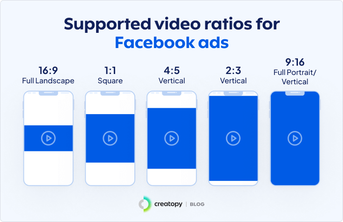
Use the Right Aspect Ratio for Each Placement
There are multiple ad placements throughout Facebook, Instagram, Messenger and Meta Audience Network. Each has different aspect ratios. Here are a few examples:
- Facebook & Instagram Feed (Single Image Ads): 1:1, or 4:5 (for vertical 4:5 is the best).
- Instagram Stories: 9:16 ratio is recommended as well.
Priorities High-Resolution Images
The first thing people see when they look at Facebook Feed ads is the quality of the images. A clear, crisp, high-resolution image looks professional and portrays an instant sense of trust and credibility for your brand. If your ad images are blurry or pixelated, audiences may just continue scrolling without giving it, or you, another thought.
Recommended Pixel Size Requirements
To ensure you’re ads look good across all devices, try to adhere to the following size requirements:
1:1 ratio (square): 1440 x 1440 px
4:5 ratio (vertical): 1440 x 1800 px
Common Mistakes to Avoid
- Poor-quality images that appear blurry or pixelated, especially when you stretch the image or it is a lower-quality image to start with.
- Phone photos that have been overly photoshopped, e.g., look doctored or fake to the audience therefore not trustworthy, genuine, or authentic.
- Generic stock photos that do not practically align with the personality of your brand.
Highlight Your Brand Clearly
Your brand is never meant to be buried in your ad-it is meant to be part of the design. The more that the branding is less obvious, the less identifiable the ad will become, and hence, people are less likely to be able to associate and remember the ad when they see it later in context to your company.
How to Showcase Your Brand Effectively
An easy to see; yet not distracting location would be your logo. It would not necessitate overtaking the image altogether but should be in a location which will be seen right away.
- Maintain consistent font, colour, and design elements across all your ads.
- People develop immediate recognition of brands from large brand identity elements like logos and even taglines, but they also develop that recognition from the clusters of smaller elements coming together on an ad as well. The more an audience sees the same elements across all your ads, the quicker they will be able to recognize your brand, even if the ad or text is too small or cluttered.
- Ensure that your branding reflects your overall company personality-modernized, friendly, professional, or luxurious, depending on your target audience.
Remember, a brand identity that is presented consistently and visibly will help generate trust, credibility, and longer-term recall.

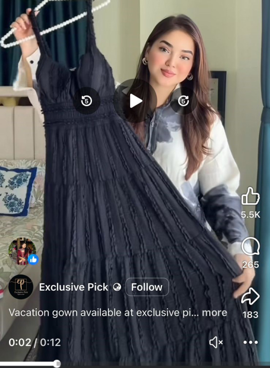
Real People Using Your Product
Real people using your product or service is one of the best ways to create authentic advertisements. What you are really doing is not selling a product, but developing a relatable story that lets an audience visualize themselves benefitting in exactly the same way.
Why This Works
- People will relate emotionally and with faces, much more than they will with things.
- Consumers are more trusting of visualizations that look true and efficient.
- When someone is using a product in “real life” a consumer can develop confidence knowing how it works and what the possibility looks like.
Best Practices
- Use models or people that resemble the demographic you are targeting. For young professionals, show a scenario of that person in the workspace or something that resembles their lifestyle.
- Avoid “stocky” or “generated” images that feel fake and not close to anything genuine. All photography should represent your idea naturally, as if the images were taken from a human, spontaneous and candid view.
- Show people with the product in an ample daily setting; in the home, the office, outdoor scenery, etc.
Use Text Overlays Wisely
Text overlays can make or break your ad’s impact. When used effectively, they highlight the core message without distracting from the visual.
Text Overlay Usage Recommendations:
- Aim to keep your text simple, concise, and bold. Your intent is to support the message in the visual, not to overwhelm the viewer.
- Use a contemporary, clean font that is simple for quick reading.
- Use colors that relate well enough to the background and contrast enough so the font stands out but doesn’t clash with the background.
Be careful of where you place any text on your image to ensure it will not block out important elements of the image, such as the product, people’s faces, or the brand logo.
Text Recommendations
- Primary text (above the image): 50-150 characters. Be creative and concise to engage readers enough to understand the ad immediately.
- Headline (below the image): Up to 27 characters. This is the most prominent line of text, so be creative and catchy.
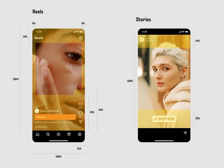
Add Motion and Sound for Engagement
Static images are valuable, but motion-based ads are much more successful at capturing attention. This is because movement attracts the eye naturally and makes your ad stand out in a busy feed where there are mostly still photos or text posts. That’s why short videos, animations, and GIFs outperform static visuals.
Why Motion Works
- More engagement: People will stop scrolling for something that is in motion.
- More explanation in less time: A video can highlight features of a product or help demonstrate benefits quickly.
- More storytelling: The combination of visuals and sound creates an emotional connection.
Best Practices for Motion Ads
- For your message, use short videos, animations, or GIFs for the quickest delivery.
- If you are including music or sound effects, make sure it aligns with your brand tone: playful, professional, calming, and energetic.
- Always include captions or on-screen text because many users watch with the sound off.
- For Stories or Reels, keep videos under 15 seconds, this will allow for maximum completion rates.
At GEEKY Social our study over 100 campaigns found that in-stream Reels achieved a CTR close to 2% with the lowest CPC (~$0.036), while static feed ads averaged 0.64% CTR with a higher CPC (~$0.11). This demonstrates that short-form video ads not only grab attention but are also more cost-efficient in driving traffic compared to static posts.
Always Preview Before Publishing
Even the most beautifully designed ad can go a miss if it doesn’t render perfectly to the consumer. Because of this, it is very important to preview your ads within the Meta Ads Manager before hitting publish. The preview tool allows you to use your ad just as your audience will across the many devices and placements.
What to Check in Ad Preview
- Mobile vs Desktop: Make sure your text is readable and your images aren’t being cropped incorrectly on smaller screens.
- Feed vs Stories: Ensure your background visuals are optimised for square/fullscreen feeds and for Stories.
- Facebook vs Instagram: To follow the correct brand guidelines and also to check for any layout changes on both platforms.
- Aspect ratio tolerance: 3%
- Special formats: 360 photos and panoramas for interactive ads (that will work super well for an immersive experience, for travel, events, or real estate).
When you preview before blasting, you can be sure that the ads look clean, professional, and cohesive everywhere.
Share Now on social media
Join Our Newsletter
Stay up-to-date with latest media insights and updates